Role UX/ UI, Re-branding
Date 2022
The challenge to win back customers
Naturbutikken (NB) is the premier store of the Danish Ornithological Society, catering to the needs of nature enthusiasts who love birdwatching and exploring the great outdoors. Our knowledgeable staff are always ready to assist customers and share their valuable insights. However, the store has experienced a decline in sales by 40% over the past two years. It has been reported that many users leave the website at the product filtering page without making any purchases. My goal is to restore customers’ confidence and ensure they stay on our site to purchase.
Observation: the website is like real nature – easy to get lost in
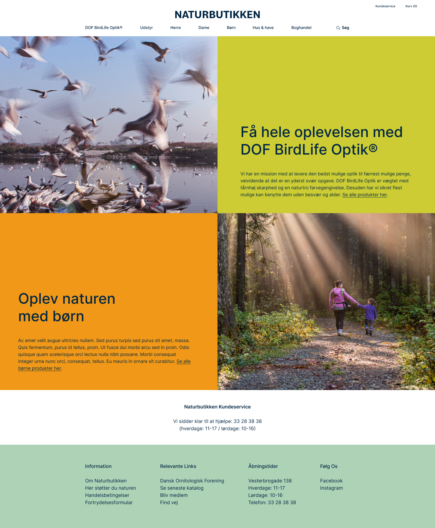
The landing page has fantastic birds shifting video. However, many options come up when the cursor goes through the menu.
A good product filter will guide the curious but not so acknowledged customers through the choosing and purchasing journey. As an ordinary person, what kind of lens or quality of the binocular might need to be more common sense. A bigger product image or a huge on-sale sign might not even mean anything to them/ us.
Process
a. Sorting the menu/ website structure
NB offers a diverse selection of products which includes outdoor gear and clothing. Nevertheless, their expertise is in the field of bird-watching binoculars and telescopes. They are the exclusive seller of binoculars with the unique optic brand DOF BirdLife Optik® in Denmark. Therefore, DOF BirdLife Optik® is given priority on their menu, despite its unfamiliarity to many visitors. The remaining products have been categorized under equipment and clothing. In the future, a card-sorting user testing section will be arranged.
b. Defining colour palette: bring back the joy of being in the nature
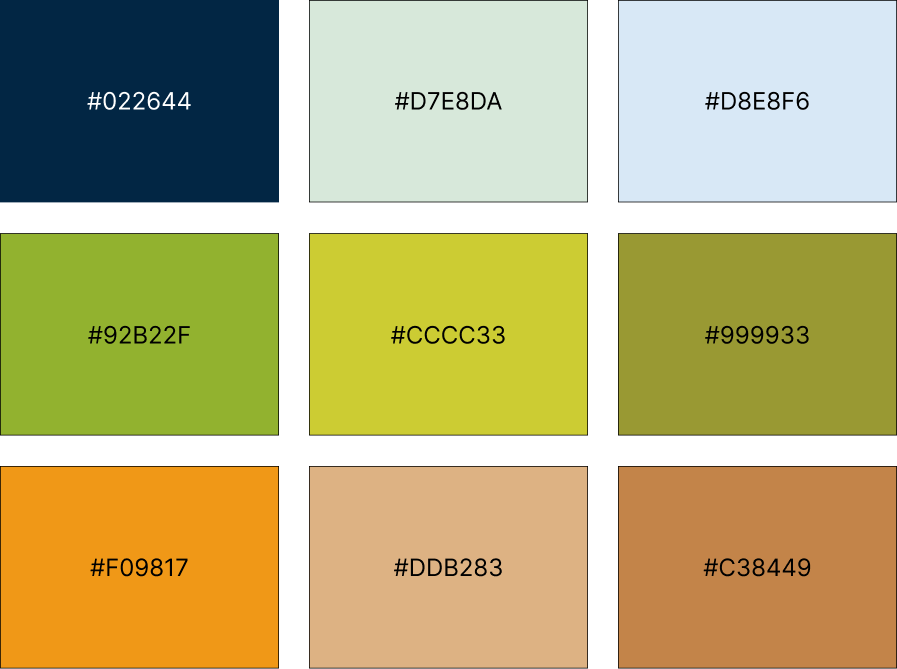
NB’s only visual identity request is to maintain green and blue. I incorporated additional colours to enhance the website’s natural feel and evoke inclusive emotions. The logo and text are presented in a deep ocean blue hue, creating a soothing and comfortable browsing experience.

c. The gird system: make the site more dynamic
Regarding the product page, NB has a particular grid requirement. This grid allows NB to guide users through sharing more stories about their products or offering recommendations for the upcoming season. Therefore, I expanded the grid to the landing page to enhance the site’s dynamism and make it more inviting for nature enthusiasts of all levels.

d. The filter that is for everyone
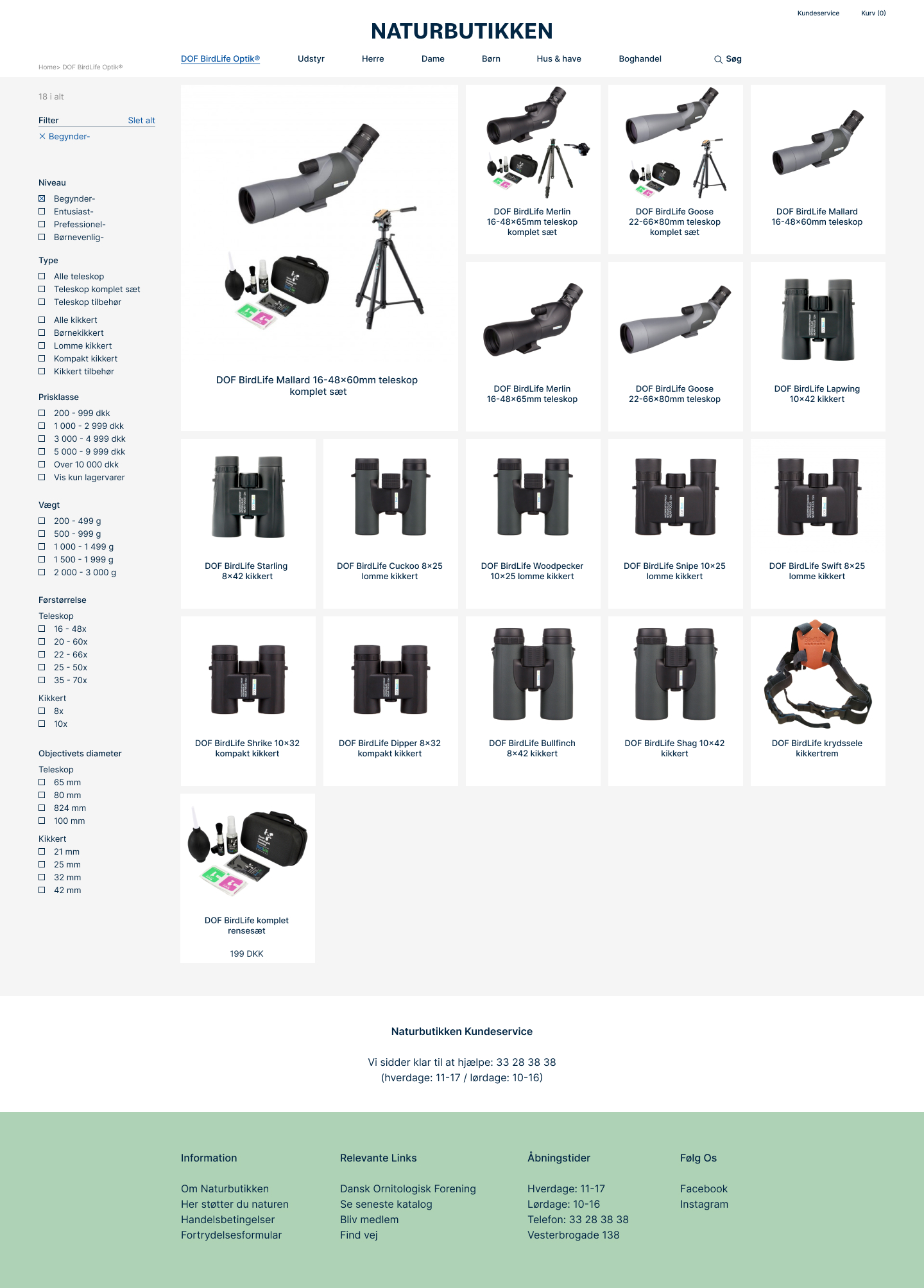
This filter is designed to help those with little or no knowledge about lenses or binoculars and those looking for more advanced options. It is currently being tested for different user groups. The filter begins by asking about the user’s level of expertise (beginner, professional, or purchasing for a child), followed by a choice between binoculars or telescopes and price range. Weight and size are listed at the bottom for more experienced users. Users can view products while the filter menu is open or closed.

Further improvement
Our project aims to recover from the sales drop by improving the product filter. To boost sales, we propose discussing a few key aspects, such as:
a) presenting prices more clearly (currently, prices end with nine, and the unique membership price includes .05, which can be confusing for users); and
b) including a ‘how to choose a binocular’ section that is easy to find on the site, transforming it into a digital version of our physical shop with helpful staff. Our project is still in progress, and we’ll keep you informed.