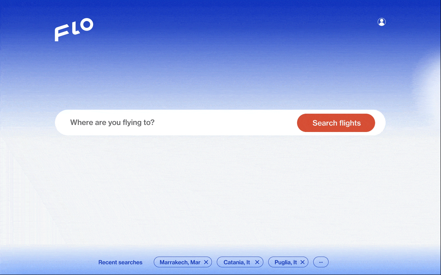
The FLO website is the ultimate solution for people purchasing flight tickets online. The website provides a seamless experience that eliminates the need for users to sift through countless options. It focuses solely on the user flow for searching and buying return flights. Planning your next getaway has never been more straightforward with FLO.
“All I need is to check the flight options and find a fare price and route without hundred of unnecessary recommendations…”
Problem diagnosis
Since numerous flight booking websites are already available, we conducted extensive research on how people utilize the service and what their experiences have been thus far.
To begin our research, we conducted competitive benchmarking by analyzing the strengths and weaknesses of major competitors such as Momondo, Kayak, Skiplagged, and Skyscanner. I also completed an online survey to gain insights into how frequently people travel and their methods for planning trips. Finally, I conducted usability tests with a few users to identify and address any issues that arose during the flight booking process.
a. Competitive benchmark
I have thoroughly compared four prominent travel websites, namely Momondo, Kayak, Skiplagged, and Skyscanner. Our evaluation primarily focused on the landing page, including its visual appeal, tone, use of colours, illustrations, images, and impression of a leisure or business-oriented experience.
Moreover, I scrutinized the search bar, search button, and any additional features available on the landing page. I also analyzed the search result page, examining the various options provided and any modifications that could be made to refine the search results further.
Lastly, I examined the ticket confirmation/purchase page to verify that all pertinent ticket information was displayed lucidly and to ascertain whether users could make any alterations at that point.
b. Online survey
Our 2021 survey shows that individuals typically visit flight booking sites between 1 to 5 times a year to purchase tickets, with the majority using a desktop or laptop. While some choose a familiar site out of habit, most prioritize finding the best price. Despite being inundated with recommendations from their chosen site, individuals still prefer to compare prices before making their final purchase.
Data was sampled from 36 people
c. Usability test
During the usability test, we observed two users booking flights using two different websites: SAS and Kayak.
Interviews were held and recorded from a desktop
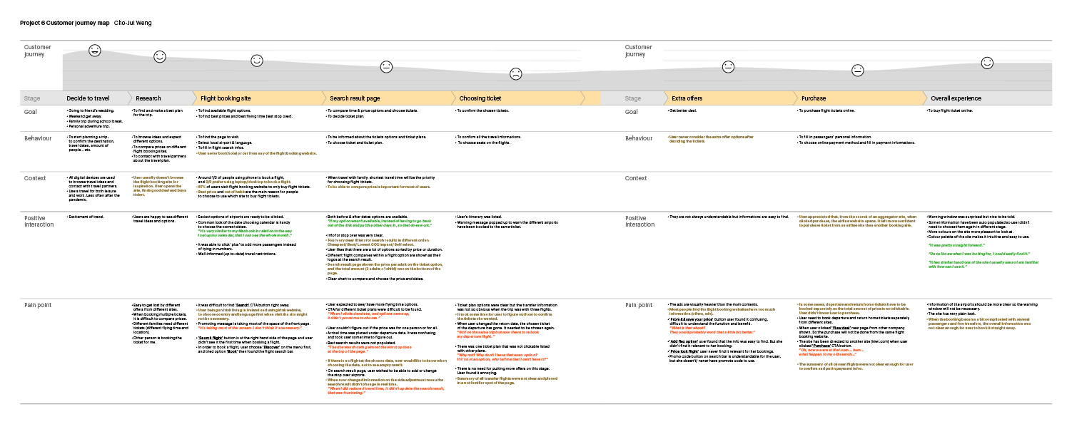
Through careful analysis of flight booking websites, I gathered research data and utilized card sorting to create an affinity diagram and customer journey map. This led to creating a customer journey map focused on the seamless flow from the initial decision to travel through to the search and purchase process on a flight booking site.
Results of problem diagnosis
My analysis showed that users’ primary objective is to book a flight. Additionally, they often search for hotels or rental cars on different websites rather than the same one for flight booking.
The users were pleased with the time-saving automatically populated information. The user-friendly interface allowed for an easy selection of options, and the site’s attractive design and clear information display were appreciated—the convenience of switching between search options added to the overall stress-free experience of purchasing flight tickets.
“It’s very similar to my MacBook in relation to the way I set up my calendar, that I can see the whole month…”
The making of FLO
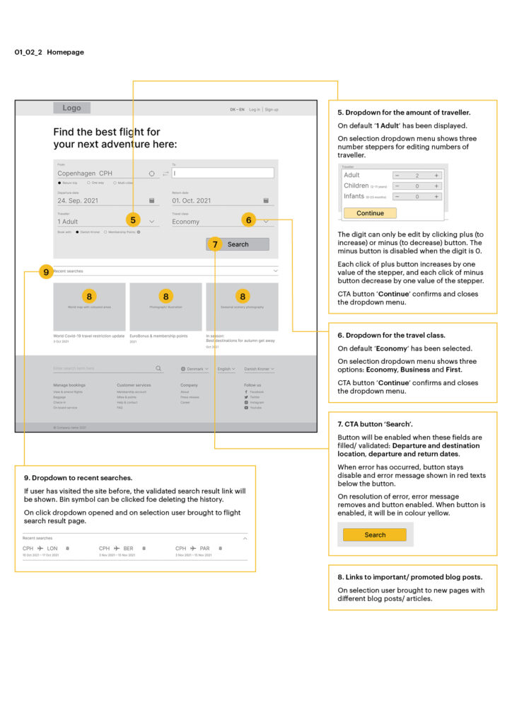
After carefully assessing the website, I confidently determined which actions needed to be taken and which features were unnecessary. With the user experience in mind, I skillfully created a flow diagram. I sketched an interaction design on paper, prioritizing the primary goal of purchasing flight tickets while providing a few reasonable options for users.
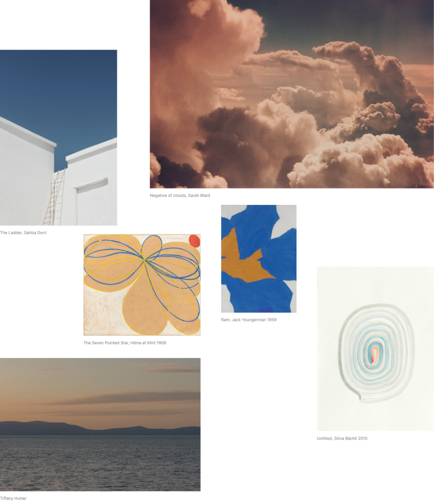
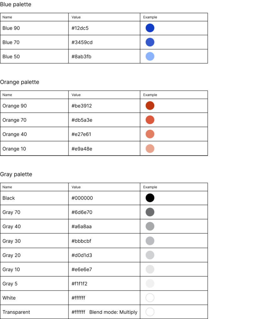
Booking flight tickets online may initially seem complicated, but our efforts to create a seamless user experience make it easier than ever. Our colour scheme has been meticulously crafted to radiate a sense of calm and peace, evocative of the awe-inspiring blue sky from an aeroplane window. During the day, the colour is a clear blue above the clouds, and during the magic hour, it transforms into a vibrant orange. Additionally, bright orange call-to-action buttons ensure users get all critical steps during the process.
Colour story:
The final prototype is under contruction. Quick glance here.